We’ve become comfortable with scrolling through a website to read and find information, and now with websites using more design techniques such as increased white space and responsive Web design, long scrolling sites are starting to appear again.
Several years ago, it was common to have long scrolling sites that where slammed with content. Well, now we are seeing long scrolling websites but the content is more organized and in a much easier format to digest.
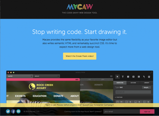
Take for instance Macaw’s website (above). Its site organizes content well, and in turn they have a long scrolling site. It doesn’t seem boring because the layout changes up throughout, and for most users, they don’t realize how far they are actually scrolling.